How to Choose the Perfect Color Palette for Any Room
Discover how to choose the perfect color palette for any room - expert tips on creating harmony, balance, and mood in your home design.
1/21/20253 min read
Color has the power to completely transform a space. It sets the mood, shapes how we feel, and defines the story your home tells. Whether you’re refreshing a bedroom, designing a cozy living room, or creating a serene workspace, choosing the right color palette is the foundation of great interior design.
At Moodspiration, we believe that color is not just decoration - it’s emotion. This guide will help you confidently select the perfect color palette for any room, blending style, mood, and function effortlessly.
Understand the Mood You Want to Create
Before you even pick up a paintbrush, take a moment to think about how you want the room to feel. Colors directly influence our emotions and energy levels:
Warm tones (terracotta, mustard, deep burgundy) bring warmth, comfort, and a sense of intimacy.
Cool tones (sage green, dusty blue, charcoal gray) evoke calmness, focus, and serenity.
Neutral palettes (beige, ivory, greige, taupe) offer versatility and timeless elegance.
Ask yourself: Is this space meant for relaxation or energy? A moody bedroom might call for deep charcoal or forest green, while a bright kitchen thrives with creamy whites and soft sage accents.
Start With a Base Color
Every great palette begins with a base color - your canvas. This is typically the shade that covers most of your room, such as the wall color, flooring, or large furniture pieces.
Choose something that complements your existing elements, like flooring or window treatments. A neutral base such as warm white, soft gray, or muted sand allows flexibility. From there, you can layer in accent tones and textures to define the character of your space.
Use the 60-30-10 Rule
This classic interior design rule is a simple yet powerful way to maintain visual balance:
60% dominant color: walls, rugs, large furniture
30% secondary color: textiles, accent chairs, drapery
10% accent color: art, accessories, throws, lighting
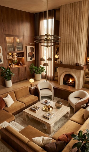
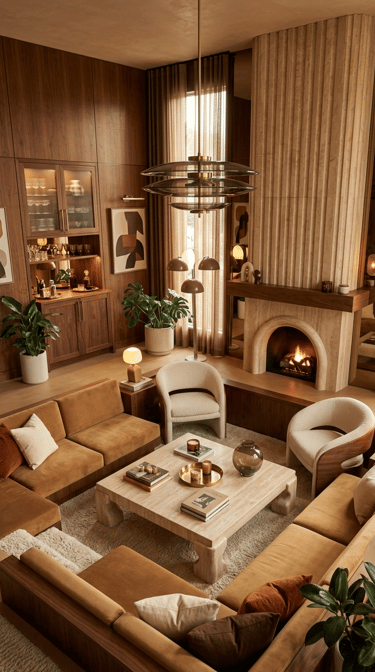
For example, imagine a living room with creamy white walls (60%), a sage-green sofa (30%), and brass lamps with ochre throw pillows (10%). The result? Effortless sophistication.
Draw Inspiration From Nature
When in doubt, look outside. Nature provides some of the most harmonious color combinations imaginable. Think of the soft blues of the sky against golden sand, or the deep greens of a forest beside earthy browns.
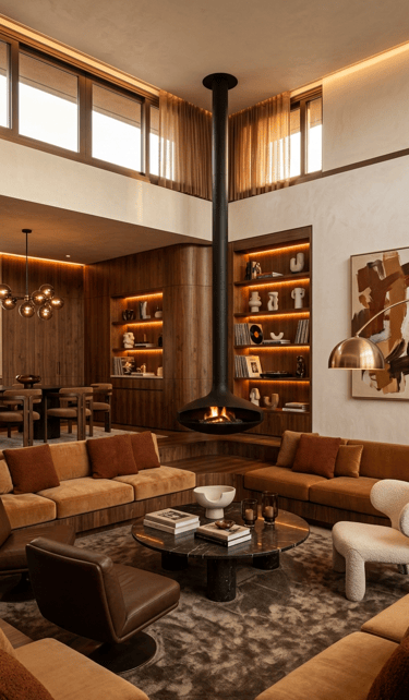
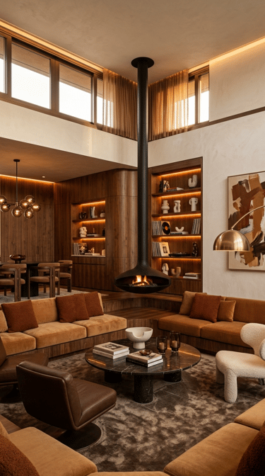
Translating these combinations indoors creates a timeless and calming effect. A forest-inspired palette might include rich greens, walnut wood tones, and golden accents - perfect for a moody living room or study.
Experiment With Texture and Light
Color doesn’t exist in isolation - it interacts with texture and light.
Natural light can make a color appear brighter and cooler, while warm artificial lighting deepens and softens tones.
In rooms with limited light, opt for lighter shades or finishes with a subtle sheen to reflect brightness.
In sun-drenched spaces, you can embrace darker hues for a dramatic yet grounded look.
Mixing velvet, linen, brass, and marble surfaces can also make a monochromatic color scheme feel rich and layered.
Use a Color Wheel (and Trust Your Instincts)
The color wheel is your best friend when it comes to balance.
Analogous schemes (colors next to each other on the wheel, like blue and green) feel harmonious.
Complementary schemes (opposites, like navy and rust) create bold contrast and energy.
Still, don’t overthink it - your instinct often knows what feels right. Try testing paint swatches on your wall and viewing them at different times of day before making the final call.
Add Depth With Dark Accents
Even in bright or minimalist spaces, a touch of darkness adds sophistication. Deep shades like charcoal, espresso, or midnight blue can frame your space and create depth.
For example, pair a cream bedroom with black picture frames and a velvet navy headboard for contrast - a subtle nod to moody home decor without overpowering the space.
Let Your Personality Shine
The most beautiful interiors reflect the people who live in them.
If you’re drawn to jewel tones, metallics, or organic neutrals, use those preferences as your guide. The key is not perfection, but authenticity - your color palette should tell your story.
Final Thoughts: Build a Palette That Evolves
A well-chosen color palette gives your home a cohesive flow, but it should also have room to grow with you. Start simple, layer over time, and let your spaces evolve as your style does.
If you’re ever unsure, begin with neutrals and add color through art, textiles, or decor - items you can easily refresh as trends change.
You May Also Like
Want daily inspiration? Follow Moodspiration on Pinterest for curated interior styles and home decor finds that match your taste.